Swiperのデモを作ってみました(サンプルコードあり)
Swiperは多機能だなぁと思う反面、細部をいじっていると結構はまることがあります。
自分のコードが悪いのかSwiperの機能がそうなのか、想像したとおりに動作しないことが多々あります。
そのたびに、他の方のコードを参考にいろいろ試してみました(先達の皆さまに感謝!)。
ということで、今回は仕事でつかえそうなコードを書きました。
よくあるパターンを取り入れていますので、サイト制作でお役立てください。
多機能スライダーSwiperとは
基本的な内容は、下記の記事を参考にどうぞ。
コード例を中心に学習したい方は、Swiper公式サイトのデモページを参照ください。
デモ前のかんたんな説明
スマートフォン時のスタイルは入っていませんので、適当に入れてください。
Swiperの機能としては、パララックス(Parallax)とフェード(Fade)が見映えがよいです。
CSSをいじってたら崩れた、ということがよくあります。
凝った作り込みをすると、思い通りに動作しないことがしょっちゅうです。
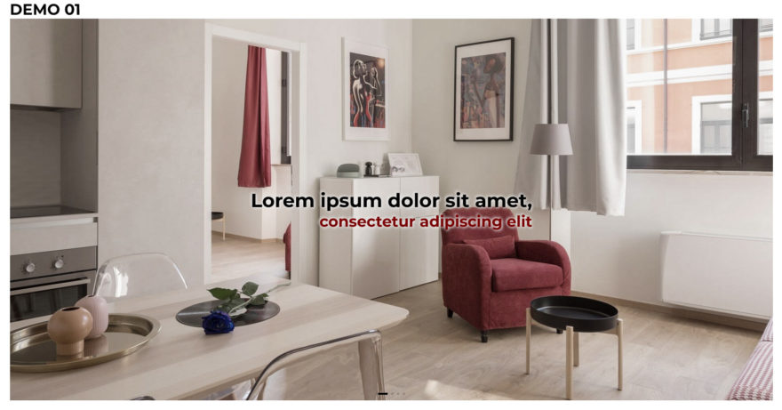
スライドの切替時にエフェクト
スライドの切替時にスライドするのではなく、黒い幕を開閉するエフェクトを入れて、切り替えるようにしました。CSSメインのエフェクトです。
デモサイトを開く「DEMO 01」
サンプルコード
<!-- Link Swiper's CSS -->
<link rel="stylesheet" href="https://cdn.jsdelivr.net/npm/swiper@9/swiper-bundle.min.css" />

<style>
  .swiper {
    max-width: 1600px;
  }

  .swiper-wrapper {
    height: auto;
  }

  .swiper-slide img {
    width: 100%;
    height: auto;
  }

  .pic {
    position: relative;
    padding-top: calc(50%);
    box-sizing: border-box;
    overflow: hidden;
    z-index: 2;
  }

  .pic img {
    display: block;
    width: 100%;
    height: 100%;
    position: absolute;
    top: 0;
    bottom: 0;
    left: 0;
    right: 0;
    filter: grayscale(0.5);
    object-fit: cover;
    z-index: 1;
  }

  /* 黒い幕 */
  .mask {
    display: block;
    position: absolute;
    top: 0;
    bottom: 0;
    right: 0;
    left: 0;
    background: linear-gradient(to right, #000 0%, #333 100%);
    transform: scale(0, 1);
    transform-origin: right top;
    transition: transform .5s ease 0s;
    z-index: 2;
  }

  .is-loaded .mask {
    transform: scale(1, 1);
  }

  .is-opened .mask {
    transform: scale(0, 1);
  }

  .is-closed .mask {
    transform-origin: left top;
    transform: scale(1, 1);
  }

  /* 画像のズームアウト */
  .zoomOut img {
    transform: scale(1.2) translate(0, 0);
    transition: transform 7s ease;
  }

  .zoomOut.swiper-slide-active img {
    transform: scale(1.1) translate(40px, -20px);
  }

  /* キャプション */
  .caption {
    color: #000;
    text-shadow: 2px 2px 5px #eee, -2px -2px 5px #eee;
    font-size: 40px;
    font-weight: bold;
    text-align: right;
    position: absolute;
    top: 50%;
    left: 50%;
    transform: translateX(-50%) translateY(-50%);
    z-index: 5;
  }

  /* フェード+ゆっくり移動 処理が重いときは外す*/
  .swiper-slide-active .caption .fadeUp {
    animation-name: fadeUpAnime;
    animation-duration: 1s;
    animation-fill-mode: forwards;
    opacity: 0;
  }

  @keyframes fadeUpAnime {
    from {
      opacity: 0;
      transform: translateX(-100px);
      filter: blur(10px);
    }

    to {
      opacity: 1;
      transform: translateX(0);
      filter: blur(0);
    }
  }

  .caption div:nth-of-type(1) {
    animation-delay: 1s;
  }

  .caption div:nth-of-type(2) {
    color: #700;
    animation-delay: 2s;
    font-size: 0.8em;
  }

  /* ページネーション関連 */
  .swiper-pagination-bullet {
    --swiper-theme-color: rgb(0, 0, 0);
    --swiper-pagination-bullet-width: 4px;
    --swiper-pagination-bullet-height: 4px;
    --swiper-pagination-bullet-border-radius: none;
    transition: .5s;
  }

  .swiper-pagination-bullet-active {
    --swiper-pagination-bullet-width: 20px;
  }
</style>

<!-- Slider main container -->
<div class="swiper">
  <!-- Additional required wrapper -->
  <div class="swiper-wrapper">
    <!-- Slides -->
    <div class="swiper-slide zoomOut">
      <div class="pic">
        <div class="mask"></div>
        <img src="https://naeco.jp/demo/img/ss01.jpg">
        <div class="swiper-lazy-preloader"></div>
      </div>
      <div class="caption">
        <div class="fadeUp">Lorem ipsum dolor sit amet,</div>
        <div class="fadeUp">consectetur adipiscing elit</div>
      </div>
    </div>
    <div class="swiper-slide zoomOut">
      <div class="pic">
        <div class="mask"></div>
        <img src="https://naeco.jp/demo/img/ss02.jpg">
      </div>
      <div class="caption">
        <div class="fadeUp">Ut enim ad minim veniam,</div>
        <div class="fadeUp">quis nostrud exercitation ullamco</div>
      </div>
    </div>
    <div class="swiper-slide zoomOut">
      <div class="pic">
        <div class="mask"></div>
        <img src="https://naeco.jp/demo/img/ss03.jpg">
      </div>
      <div class="caption">
        <div class="fadeUp">Duis aute irure dolor in</div>
        <div class="fadeUp">reprehenderit in voluptate</div>
      </div>
    </div>
    <div class="swiper-slide zoomOut">
      <div class="pic">
        <div class="mask"></div>
        <img src="https://naeco.jp/demo/img/ss04.jpg">
      </div>
      <div class="caption">
        <div class="fadeUp">Excepteur sint occaecat</div>
        <div class="fadeUp">cupidatat non proident,</div>
      </div>
    </div>
  </div>
  <!-- If we need pagination -->
  <div class="swiper-pagination"></div>
</div>

<!-- Swiper JS -->
<script src="https://cdn.jsdelivr.net/npm/swiper@9/swiper-bundle.min.js"></script>

<script>
  const swiper = new Swiper('.swiper', {
    // Optional parameters
    loop: true,
    speed: 500,
    autoplay: {
      delay: 6000,
      disableOnInteraction: false,
    },
    // If we need pagination
    pagination: {
      el: '.swiper-pagination',
      clickable: true,
    },
    on: {
      beforeTransitionStart: function () {
        const elem5 = document.querySelectorAll('.pic');
        elem5.forEach(function (elem) {
          elem.classList.add('is-closed');
        });
      },
      slideChangeTransitionEnd: function () {
        const elem6 = document.querySelectorAll('.pic');
        elem6.forEach(function (elem) {
          elem.classList.remove('is-closed');
        });
      },
    },
  });
</script>

<script>
  window.addEventListener('load', (event) => {
    const elem1 = document.querySelector('.pic');
    elem1.classList.add('is-loaded');
  });

  const elem2 = document.querySelector('.mask');
  elem2.addEventListener('transitionend', () => {
    const elem3 = document.querySelector('.pic');
    if (elem3.classList.contains('is-loaded')) {
      const elem4 = document.querySelectorAll('.pic');
      elem4.forEach(function (elem) {
        elem.classList.add('is-opened');
        elem.classList.remove('is-loaded');
      });
    }
  });
</script>
CSS 20行目…padding-topをつかって、縦横比を指定しています。
CSS 69-72行目…じわじわとズームアウトしながら移動します(よく見かけるアレ)。
CSS 126-129行目…カスタムプロパティ(CSS変数、--swiper-*)はサイト全体に効かせたい場合は、:root{}内に入れます。複数設置することが多いので、全体に一律で効かせることはあまりないかもしれませんが。
HTML 147行目…読込中にまわるスピナー(Swiper標準装備)を設置しました。一枚目の画像の下に書きます。読み込みが終わると勝手に消えます。
HTML 149-151行目…複数行のtransformがあるときは、要素を分けないと動作しません。
パラメーターとイベント
| clickable: true | pagenationでつかう。 ページネーションタイプがbullets(丸)の場合、ページネーションボタンをクリックすると適切なスライドに遷移します。 |
| disableOnInteraction: false | autoplayでつかう。 ユーザー操作 (スワイプ) の後でも自動再生は無効になりません。 |
| beforeTransitionStart | イベント。遷移開始前にイベントが発生します。 |
| slideChangeTransitionEnd | イベント。他のスライド (次または前) へのアニメーションの後に発生します。 |
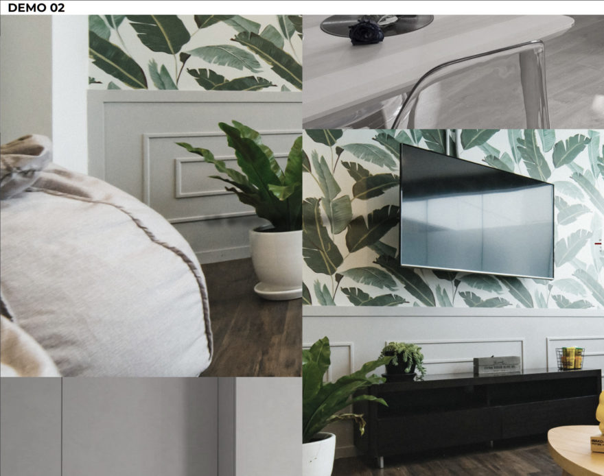
2枚並べて縦に上下スライド
上下にスライドさせるスライダーを横に並べて、ダイナミックな動きをつけました。
中央の文字の切り替わりもスライダー(mySwiper3)で実装しています。
デモサイトを開く「DEMO 02」
サンプルコード
<!-- Link Swiper's CSS -->
<link rel="stylesheet" href="https://cdn.jsdelivr.net/npm/swiper@9/swiper-bundle.min.css" />

<style>
body {
  margin: 0; /* 画像にわずかなズレがあるときはここ */
}

.wrapper {
  display: flex;
}

.swiper-pagination-bullet {
  --swiper-pagination-bullet-width: 4px;
  --swiper-pagination-bullet-height: 4px;
  --swiper-pagination-bullet-border-radius: none;
  transition: 1s;
}

.swiper-pagination-vertical.swiper-pagination-bullets .swiper-pagination-bullet,
.swiper-vertical>.swiper-pagination-bullets .swiper-pagination-bullet {
  --swiper-theme-color: #700;
  margin-left: auto;
}

.swiper-pagination-bullet-active {
  --swiper-pagination-bullet-width: 20px;
}

.mySwiper,
.mySwiper2 {
  width: 50%;
  height: 100vh;
  overflow: hidden;
}

.mySwiper3 {
  position: absolute;
  top: 50%;
  left: 50%;
  width: auto;
  height: 100px;
  transform: translate(-50%, -100%);
  font-size: 40px;
  color: #000;
  text-align: center;
  text-shadow: 1px 1px 1px #000, -1px 1px 1px #000, 1px -1px 1px #000, -1px -1px 1px #000;
}

.swiper-slide {
  height: 100vh;
  position: relative;
}

.swiper-slide div {
  width: 100%;
  height: 100%;
  overflow: hidden;
}

.swiper-slide img {
  filter: grayscale(0.9);
  object-fit: cover;
  height: 100%;
  z-index: 1;
}

.mySwiper .swiper-slide img {
  object-position: 0 top;
}

.mySwiper2 .swiper-slide img {
  object-position: -50vw top;
}

.mySwiper .swiper-slide-active img,
.mySwiper2 .swiper-slide-active img {
  filter: grayscale(0.5);
}

.mySwiper3 .swiper-slide-active .fade {
  animation-name: fadeUpAnime;
  animation-duration: 1s;
  animation-fill-mode: forwards;
  opacity: 0;
}

@keyframes fadeUpAnime {
  from {
    opacity: 0;
    filter: blur(50px);
  }

  to {
    opacity: 1;
    filter: blur(0);
  }
}
</style>

<div class="wrapper">
  <!-- Swiper (左スライダー)-->
  <div class="swiper mySwiper">
    <div class="swiper-wrapper">
      <div class="swiper-slide">
        <div>
          <img src="https://naeco.jp/demo/img/ss01.jpg">
        </div>
      </div>
      <div class="swiper-slide">
        <div>
          <img src="https://naeco.jp/demo/img/ss02.jpg">
        </div>
      </div>
      <div class="swiper-slide">
        <div>
          <img src="https://naeco.jp/demo/img/ss03.jpg">
        </div>
      </div>
      <div class="swiper-slide">
        <div>
          <img src="https://naeco.jp/demo/img/ss04.jpg">
        </div>
      </div>
    </div>
  </div>
  <!-- Swiper (右スライダー)-->
  <div class="swiper mySwiper2">
    <div class="swiper-wrapper">
      <div class="swiper-slide">
        <div>
          <img src="https://naeco.jp/demo/img/ss01.jpg">
        </div>
      </div>
      <div class="swiper-slide">
        <div>
          <img src="https://naeco.jp/demo/img/ss04.jpg">
        </div>
      </div>
      <div class="swiper-slide">
        <div>
          <img src="https://naeco.jp/demo/img/ss03.jpg">
        </div>
      </div>
      <div class="swiper-slide">
        <div>
          <img src="https://naeco.jp/demo/img/ss02.jpg">
        </div>
      </div>
    </div>
    <!-- If we need pagination -->
    <div class="swiper-pagination"></div>
  </div>
  <!-- Swiper (文字)-->
  <div class="swiper mySwiper3">
    <div class="swiper-wrapper">
      <div class="swiper-slide">
        <div class="fade">Lorem ipsum dolor sit amet</div>
      </div>
      <div class="swiper-slide">
        <div class="fade">Ut enim ad minim veniam</div>
      </div>
      <div class="swiper-slide">
        <div class="fade">Duis aute irure dolor in reprehenderit</div>
      </div>
      <div class="swiper-slide">
        <div class="fade">Excepteur sint occaecat cupidatat non proident</div>
      </div>
    </div>
  </div>
</div>

<!-- Swiper JS -->
<script src="https://cdn.jsdelivr.net/npm/swiper@9/swiper-bundle.min.js"></script>

<!-- Initialize Swiper -->
<script>
  const swiper = new Swiper(".mySwiper", {
    allowTouchMove: false,
    direction: "vertical",
    loop: true,
    speed: 1000,
    simulateTouch: false,
    autoplay: {
      delay: 5000,
      disableOnInteraction: false,
      reverseDirection: true, //スライド逆回転
      pauseOnMouseEnter: false,
    },
    freeMode: {
      enabled: true,
      momentum: false,
    },
  });

  const swiper2 = new Swiper(".mySwiper2", {
    allowTouchMove: false,
    direction: "vertical",
    loop: true,
    speed: 1000,
    simulateTouch: false,
    autoplay: {
      delay: 5000,
      disableOnInteraction: false,
      pauseOnMouseEnter: false,
    },
    // If we need pagination
    pagination: {
      el: '.swiper-pagination',
    },
    freeMode: {
      enabled: true,
      momentum: false,
    },
  });

  const swiper3 = new Swiper(".mySwiper3", {
    allowTouchMove: false,
    direction: "vertical",
    loop: true,
    speed: 1000,
    simulateTouch: false,
    autoplay: {
      delay: 5000,
      disableOnInteraction: false,
      pauseOnMouseEnter: false,
    },
    freeMode: {
      enabled: true,
      momentum: false,
    },
  });

  //スライドごとのズレをリセットする
  swiper.on('slideChangeTransitionEnd', () => {
    swiper2.on('slideChangeTransitionEnd', () => {
      swiper.autoplay.stop();
      swiper2.autoplay.stop();
      swiper3.autoplay.stop();
      swiper.autoplay.start();
      swiper2.autoplay.start();
      swiper3.autoplay.start();
    });
  });
  swiper2.on('slideChangeTransitionEnd', () => {
    swiper.on('slideChangeTransitionEnd', () => {
      swiper.autoplay.stop();
      swiper2.autoplay.stop();
      swiper3.autoplay.stop();
      swiper.autoplay.start();
      swiper2.autoplay.start();
      swiper3.autoplay.start();
    });
  });
  swiper.on('resize', () => {
    swiper.autoplay.stop();
    swiper2.autoplay.stop();
    swiper3.autoplay.stop();
    swiper.autoplay.start();
    swiper2.autoplay.start();
    swiper3.autoplay.start();
  });
</script>
パソコン閲覧時にブラウザを最大化・縮小すると、画像のスライドするタイミングが左右で揃わなくなります(逆回転の影響があるらしい)。
余談ですが、swiper大外にdir="rtl"をつけるとスライドの方向が逆(左←右)になります。
CSS6行目…ブラウザのデフォルトのスタイルでmarginが入っていますので、0にします。ズレの原因になります。
CSS 74行目…右スライドの画像表示をobject-positionでずらしています。
JS 187行目…controllerという各スライダーを連動させるモジュールがありますが、逆回転(reverseDirection: true)を入れていると正常動作しませんでした。
JS 190-193行目…freeModeを入れるとタイミングをリセットしてくれるようです。
JS 237-242行目…swiper.autoplay.stop()、swiper.autoplay.start()で待ち時間をリセットできます。毎回スライダーごとのズレを揃えています。ここのコードは工夫の余地があるかもしれません。
パラメーターとイベント
| allowTouchMove: false | ズレる原因になるので、タッチ操作を許可しません。 |
| direction: "vertical" | 垂直方向にまわるスライダー。 |
| simulateTouch: false | ズレる原因になるので、マウスイベント、タッチイベントを許可しません。 |
| reverseDirection: true | autoplayでにつかう。スライドの逆回転。 1→4→3→2とまわります。dir="rtl"とはまわり順が違います。 |
| resize | イベント。ウィンドウのサイズ変更時にイベントが発生します。 |
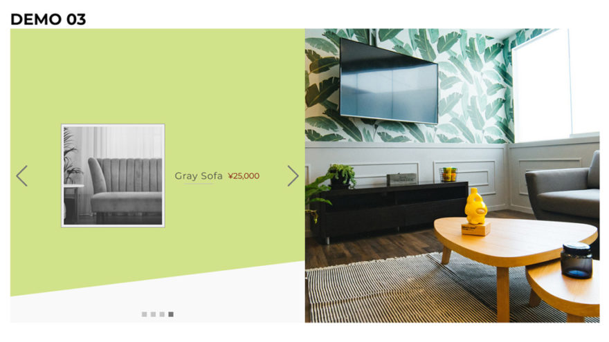
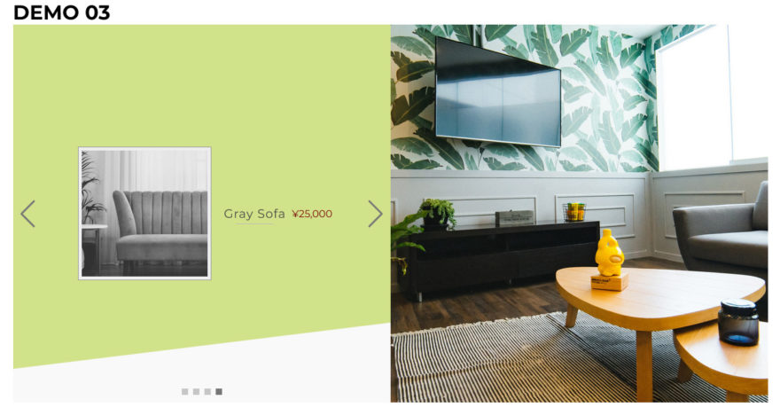
商品を見せるのに使えそうな2枚横並び
画像2枚を横に並べて、エフェクトにフェードとパララックスを使っています。
商品を見せるのによさそうな見せ方です。
デモサイトを開く「DEMO 03」
サンプルコード
<!-- Link Swiper's CSS -->
<link rel="stylesheet" href="https://cdn.jsdelivr.net/npm/swiper@9/swiper-bundle.min.css" />

<style>
  .wrapper {
    display: flex;
    justify-content: center;
    align-items: center;
    width: 100%;
    height: 100%;
  }

  .swiper {
    --swiper-theme-color: #777;
    --swiper-pagination-bullet-width: 10px;
    --swiper-pagination-bullet-height: 10px;
    --swiper-pagination-bullet-border-radius: none;
    max-width: 1200px;
    height: 600px;
    background: #f9f9f9;
  }

  .swiper-button-next,
  .swiper-rtl .swiper-button-prev {
    --swiper-navigation-sides-offset: calc(50% + 10px);
  }

  .swiper-slide {
    display: flex;
    overflow: hidden;
  }

  .swiper-slide .image img {
    width: 100%;
    height: 100%;
    object-fit: cover;
  }

  .swiper-slide .text,
  .swiper-slide .image {
    width: 50%;
    overflow: hidden;
    text-align: center;
  }

  .swiper-slide .text {
    color: #555;
    display: flex;
    justify-content: center;
    align-items: center;
    flex-wrap: wrap;
    flex-direction: column;
    text-align: center;
    overflow: hidden;
  }

  @media (min-width: 1200px) {
    .swiper-slide .text {
      flex-direction: row;
    }
  }

  .swiper-slide .text img {
    width: 200px;
    background: #eee;
    border: 1px solid #999;
    margin: 10px;
    padding: 5px;
  }

  .pagenation-wrapper {
    width: 50%;
    position: absolute;
    bottom: 0;
    left: 0;
  }

  .title {
    color: #444;
    font-size: 1.2em;
    letter-spacing: 1px;
    margin: 10px;
  }

  .title:before {
    content: '';
    position: absolute;
    bottom: -5px;
    left: 50%;
    display: inline-block;
    width: 60px;
    height: 1px;
    transform: translateX(-50%);
    background-color: #bbb;
    border-radius: 2px;
  }

  .price {
    color: #700;
  }

  /* 斜めの背景 */
  .slant-bg {
    position: relative;
    width: 100%;
    margin: 0;
    overflow: hidden;
  }

  .slant-bg p {
    width: 65%;
    margin: 0 auto;
  }

  .slant-bg::before {
    content: '';
    position: absolute;
    top: 0;
    bottom: 0;
    left: 0;
    right: 0;
    transform: skewY(-7deg) translateY(-90px);
    transition: 10s;
    z-index: -1;
  }

  /* 背景色 */
  .swiper-slide:nth-of-type(1) .slant-bg::before {
    background: #ffcfcf;
  }

  .swiper-slide:nth-of-type(2) .slant-bg::before {
    background: #B1D7F9;
  }

  .swiper-slide:nth-of-type(3) .slant-bg::before {
    background-color: #F2E7AC;
  }

  .swiper-slide:nth-of-type(4) .slant-bg::before {
    background-color: #D1E28A;
  }
</style>

<div class="wrapper">
  <div class="swiper">
    <div class="swiper-wrapper">
      <div class="swiper-slide">
        <div class="text slant-bg">
          <img src="https://naeco.jp/demo/img/ss01th.jpg" data-swiper-parallax-x="-50" >
          <h2 class="title" data-swiper-parallax-y="-20">Wooden Table</h2>
          <div class="price" data-swiper-parallax-y="-40" data-swiper-parallax-duration="1500">¥9,800</div>
        </div>
        <div class="image">
          <img src="https://naeco.jp/demo/img/ss01.jpg" data-swiper-parallax-x="-50">
        </div>
      </div>
      <div class="swiper-slide">
        <div class="text slant-bg">
          <img src="https://naeco.jp/demo/img/ss02th.jpg" data-swiper-parallax-x="-50">
          <h2 class="title" data-swiper-parallax-y="-20">Blue Sofa</h2>
          <div class="price" data-swiper-parallax-y="-40" data-swiper-parallax-duration="1500">¥18,000</div>
        </div>
        <div class="image">
          <img src="https://naeco.jp/demo/img/ss02.jpg" data-swiper-parallax-x="-50">
        </div>
      </div>
      <div class="swiper-slide">
        <div class="text slant-bg">
          <img src="https://naeco.jp/demo/img/ss03th.jpg" data-swiper-parallax-x="-50">
          <h2 class="title" data-swiper-parallax-y="-20">Orange Chair</h2>
          <div class="price" data-swiper-parallax-y="-40" data-swiper-parallax-duration="1500">¥13,000</div>
        </div>
        <div class="image">
          <img src="https://naeco.jp/demo/img/ss03.jpg" data-swiper-parallax-x="-50">
        </div>
      </div>
      <div class="swiper-slide">
        <div class="text slant-bg">
          <img src="https://naeco.jp/demo/img/ss04th.jpg" data-swiper-parallax-x="-50">
          <h2 class="title" data-swiper-parallax-y="-20">Gray Sofa</h2>
          <div class="price" data-swiper-parallax-y="-40" data-swiper-parallax-duration="1500">¥25,000</div>
        </div>
        <div class="image">
          <img src="https://naeco.jp/demo/img/ss04.jpg" data-swiper-parallax-x="-50">
        </div>
      </div>
    </div>
    <!-- If we need pagination -->
    <div class="pagenation-wrapper">
      <div class="swiper-pagination"></div>
    </div>
    <!-- If we need navigation buttons -->
    <div class="swiper-button-prev"></div>
    <div class="swiper-button-next"></div>
  </div>
</div>

<!-- Swiper JS -->
<script src="https://cdn.jsdelivr.net/npm/swiper@9/swiper-bundle.min.js"></script>

<!-- Initialize Swiper -->
<script>
  const mySwiper = new Swiper('.swiper', {
    effect: 'fade',
    fadeEffect: {
      crossFade: true
    },
    loop: true,
    speed: 1500,
    parallax: true,
    autoplay: {
      delay: 1000,
    },
    // If we need pagination
    pagination: {
      el: '.swiper-pagination',
    },
    // Navigation arrows
    navigation: {
      nextEl: '.swiper-button-next',
      prevEl: '.swiper-button-prev',
    },
  });
</script>
CSS 25行目…右ナビゲーションボタンの位置を変更しています。
CSS 150行目…左文字は、横幅に応じて縦並びにしています。
JS 206行目…fadeを指定しておかないと、いい感じになりません。
パラメーターとイベント
| effect: 'fade' | フェード効果。遷移時にじんわり現れて消えます。 |
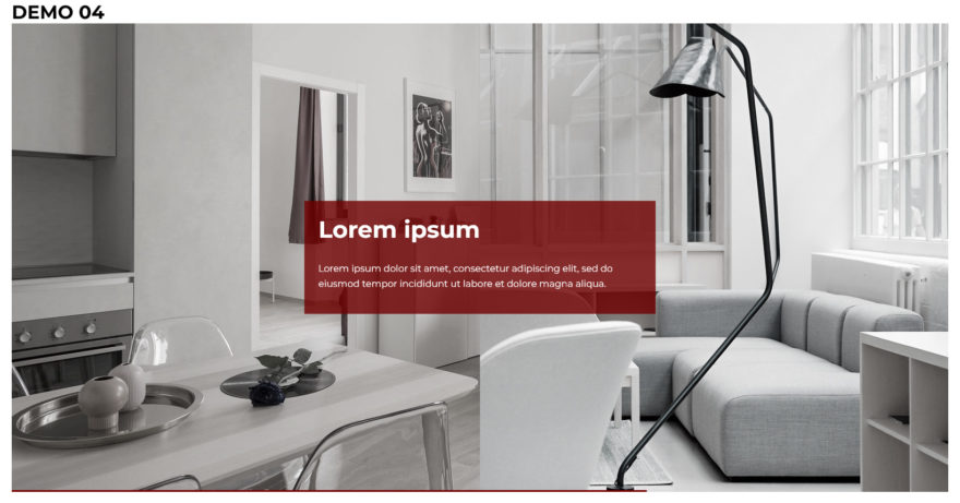
2枚横並び+プログレスバー
グリグリ動く、派手めなパララックスが印象的なスライダーです。
たまーに付けたくなるプログレスバーも実装しました。
サンプルコード
<!-- Link Swiper's CSS -->
<link rel="stylesheet" href="https://cdn.jsdelivr.net/npm/swiper@9/swiper-bundle.min.css" />

<style>
  h1 {
    max-width: 1600px;
    margin: 0 auto;
  }

  .swiper {
    max-width: 1600px;
  }

  .swiper-wrapper {
    height: auto;
  }

  .swiper-slide {
    display: flex;
    justify-content: center;
    align-items: center;
    width: 100%;
    padding-top: calc(50%);
    box-sizing: border-box;
    overflow: hidden;
  }

  .swiper-slide .image {
    position: absolute;
    top: 0;
    left: 0;
    width: 100%;
    height: 100%;
    overflow: hidden;
  }

  .swiper-slide .image img {
    position: absolute;
    top: 0;
    left: 0;
    width: 100%;
    height: 100%;
    overflow: hidden;
    object-fit: cover;
    filter: grayscale(0.9);
  }

  .swiper-slide .image:nth-of-type(2) {
    left: 50%;
  }

  .swiper-slide .image:nth-of-type(2) img {
    left: -50%; /* 元画像のどのあたりを表示するか */
  }

  .caption {
    color: #fff;
    background-color: rgba(112, 0, 0, 0.8);
    max-width: 600px;
    overflow: hidden;
    margin-top: calc(-50%);
    padding: 1.5em;
    box-sizing: border-box;
  }

  .title {
    font-size: 40px;
    font-weight: bold;
    margin: 0;
  }

  .text {
    line-height: 1.6;
    margin: 30px 0 15px;
  }

  /* プログレスバー */
  .autoplay-progress {
    --swiper-theme-color: #ff9;
    position: absolute;
    bottom: 0;
    left: 0;
    z-index: 10;
    width: 100%;
    height: 3px;
    color: var(--swiper-theme-color);
  }

  .autoplay-progress svg {
    --progress: 50;
    position: absolute;
    top: 0;
    left: 0;
    z-index: 10;
    width: 100%;
    height: auto;
    stroke-width: 3px;
    stroke: var(--swiper-theme-color);
    fill: none;
    stroke-dashoffset: calc(100px * (1 - var(--progress))); /* オフセット=実線部分は100%で0 */
    stroke-dasharray: 100px; /* 実線と間隔- - */
  }

  .autoplay-progress line {
    width: 100%;
  }
</style>

<h1 id="#demo04">DEMO 04</h1>
<div class="swiper">
  <div class="swiper-wrapper">
    <div class="swiper-slide">
      <div class="image">
        <img src="https://naeco.jp/demo/img/ss01.jpg" data-swiper-parallax-x="50%" data-swiper-parallax-scale="1.1">
      </div>
      <div class="image">
        <img src="https://naeco.jp/demo/img/ss02.jpg" data-swiper-parallax-x="80%" data-swiper-parallax-scale="1.1">
      </div>
      <div class="caption" data-swiper-parallax-x="80%">
        <div class="title" data-swiper-parallax-x="-50%" data-swiper-parallax-duration="800">Lorem ipsum</div>
        <div class="text" data-swiper-parallax-x="-50%" data-swiper-parallax-duration="1000">Lorem ipsum dolor sit amet, consectetur
          adipiscing elit, sed do eiusmod tempor incididunt ut labore et dolore magna aliqua. </div>
      </div>
    </div>

    <div class="swiper-slide">
      <div class="image">
        <img src="https://naeco.jp/demo/img/ss03.jpg" data-swiper-parallax-x="50%" data-swiper-parallax-scale="1.1">
      </div>
      <div class="image">
        <img src="https://naeco.jp/demo/img/ss04.jpg" data-swiper-parallax-x="80%" data-swiper-parallax-scale="1.1">
      </div>
      <div class="caption" data-swiper-parallax-x="80%">
        <div class="title" data-swiper-parallax-x="-50%" data-swiper-parallax-duration="800">Ut enim</div>
        <div class="text" data-swiper-parallax-x="-50%" data-swiper-parallax-duration="1000">Ut enim ad minim veniam, quis nostrud
          exercitation ullamco laboris nisi ut aliquip ex ea commodo consequat. </div>
      </div>
    </div>

  </div>
  <div class="autoplay-progress">
    <svg viewBox="0 0 100 1">
      <line x1="0" y1="0" x2="100" y2="1" />
    </svg>
  </div>
</div>

<!-- Swiper JS -->
<script src="https://cdn.jsdelivr.net/npm/swiper@9/swiper-bundle.min.js"></script>

<script>
  const progressCircle = document.querySelector(".autoplay-progress svg");
  const swiper = new Swiper('.swiper', {
    loop: true,
    speed: 1000,
    autoplay: {
      delay: 3000,
      disableOnInteraction: false,
    },
    parallax: true,
    on: {
      autoplayTimeLeft(s, time, progress) {
        progressCircle.style.setProperty("--progress", 1 - progress);
      },
    },
  });
</script>
CSS 23行目…スライドのpadding-topで縦横比を固定しています。
CSS 28-54行目…2枚の画像横並びは、potision: absolute; で実装しています。
CSS 49行目…右に表示する画像を画面の右方向へずらします。
CSS 77-106行目…プログレスバー。
CSS 100行目…公式のデモに円形の進捗メーターがありますが、コードに不具合があって、SafariやFirefoxでは動作しません。正しくは「px」が必要です。
JS 162-164行目…自動再生中は常時イベントが発生し、残り時間(progress)を取得して、カスタムプロパティ(--progress)に数値をセットします。これをCSS 100行目で計算し、プログレスバーを描画しています。
パラメーターとイベント
| autoplayTimeLeft | イベント。次のスライドに移行するまでの残り時間 (ミリ秒) と、割合(0~1)が得られます。 |
おわりに
目をひくメインヴィジュアルがトップページにあったほうが、昨今のサイトっぽいですよね。
Swiperを使って作り込むという作業は結構大変で、今後も適宜情報収集して仕事用に作りためていきたいと思います。
執筆者

えいじ@naeco.jp この記事を書いた人
自作するのが好きですぐに試したくなる、凝り性なWebエンジニア。
カラーミーショップ、モールなどのECについて記事にしています。
ご相談・お問い合わせはこちら